
Landscapes – online tuition
Landscapes in watercolour
Welcome to my free written online tutorial – painting landscapes in watercolour. I welcome you to ask me any questions (info@kayeparmenter.co.uk)
So, there is a view that you love. Before you start to paint, ask yourself “why do I want to paint this landscape?” The view has captivated me….but why? Was it the light? Or the distant view? Or the colours, the atmosphere, the drama, a lovely sky, the time of day, the foreground?
So “how do I capture what I have seen?”
The things we can use to help us:
- Composition – the way we lay out the painting. (i.e. distant view)
- Colour – the colours we choose (i.e. lovely sky, time of day)
- Tone – from the very light, to the very dark (i.e. atmosphere, light)
- Texture – foliage and trees (i.e. foreground)
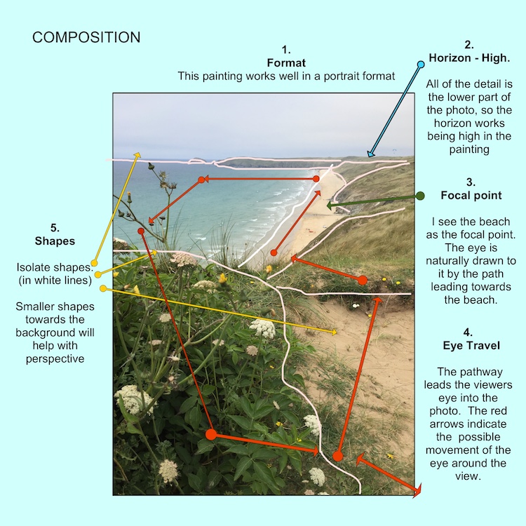
COMPOSITION
1. Which format should I use?
For a landscape painting, you don’t necessarily need to choose a landscape format. Ask yourself whether the vista could suit a portrait format. Think about this carefully before you start.
2. Where should I put the horizon?
With the 3rd concept, you place the horizon either at the top third or bottom third of the painting. If you have a dramatic sky, it works well to place the horizon lower in the painting. If you have a detailed landscape, place the horizon higher.
3. What is my focal point?
A landscape painting doesn’t necessarily need a focal point. But if it does, it is a good idea to know where it is and decide how best to draw the viewers eye to it.
4. How can I encourage the viewer’s eye to move around the painting?
Using physical things such as paths and roads, you can allow the eye to follow a route. You can also use colour and tone to pull the viewers attention from one place to another within the painting.
5. How can I make the shapes within the painting interesting?
Section the landscape into interlocking shapes. Study each shape and work out how it relates to the other and how you may work with each section. You could use colour, tone and texture.
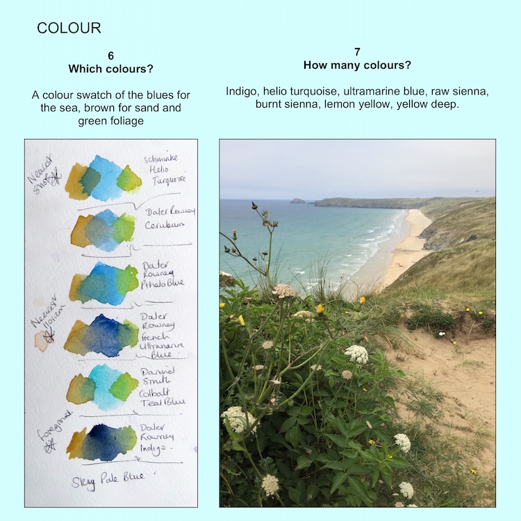
COLOUR
6. Which colours should I use?
Take all the colours from your paint box that you think might work in the landscape. Using a scrap of watercolour paper, do a small test wash of each colour and blend with others. Hold your test paper against the photo and pick the ones that you think work well. Look at the tube is ascertain whether the pigment is transparent or opaque. Opaque will give a heavier look.
7. How many colours should I use?
I would recommend approximately 6 or 7 (or less)
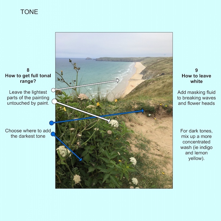
TONE
8. How can I get a full tonal range in my painting?
Leave some paper untouched by the paint. Choose where to add the darkest tone to your painting.
9. How do I leave the paper white and how do I get a good dark tone?
You can either use masking fluid to retain the white paper. Or paint around the white sections. Add less water to your pigments to make them darker. Certain pigments will give a darker tone – i.e. indigo and lemon yellow will you give a dark blue.
TEXTURE
10. How can I get texture into my painting?
Adding salt to a drying wash will give a speckled effect. Drops of water flicked onto a drying wash will also give a speckled effect. Laying scrunched up clingfilm and gently pressing onto the surface of a drying wash will give an interesting foliage effect.
Have fun with your landscape paintings and try to recreate that magic!